Thursday, 23 April 2015

Hidden the Visible

https://thegenealogyofstyle.wordpress.com/tag/magritte/


Hidden the Visible

The Son of Man (1964)

René Magritte painted it as a self-portrait. The painting consists of a man in an overcoat and a bowler hat standing in front of a low wall, beyond which is the sea and a cloudy sky. The man’s face is largely obscured by a hovering green apple. However, the man’s eyes can be seen peeking over the edge of the apple. Another subtle feature is that the man’s left arm appears to bend backwards at the elbow.


About the painting, Magritte said:
“At least it hides the face partly well, so you have the apparent face, the apple, hiding the visible but hidden, the face of the person. It’s something that happens constantly. Everything we see hides another thing, we always want to see what is hidden by what we see. There is an interest in that which is hidden and which the visible does not show us. This interest can take the form of a quite intense feeling, a sort of conflict, one might say, between the visible that is hidden and the visible that is present.”

The Great War on Façades (1964)

Man in a Bowler Hat (1964)

The Son of Man resembles The Great War on Façades (La Grande Guerre Façades), another Magritte painting featuring similar imagery. Both feature a person standing in front of a wall overlooking the sea. The Great War on Façades, however, features a woman holding an umbrella, her face covered by a flower. There is also Man in the Bowler Hat, a similar painting where the man’s face is obscured by a bird rather than an apple.

A is for Apple

https://thegenealogyofstyle.wordpress.com/

A is for Apple


The Beatles‘ accountants had informed the group that they had two million pounds which they could either invest in a business venture or else lose to the Inland Revenue, because corporate/business taxes were lower than their individual tax bills. According to Peter Brown, personal assistant to Beatles’ manager Brian Epstein, activities to find tax shelters for the income that the Beatles generated began as early as 1963–64, when Dr Walter Strach was put in charge of such operations. First steps into that direction were the foundation of Beatles Ltd and, in early 1967, Beatles and Co.
The Beatles’ publicist, Derek Taylor, remembered that Paul McCartney had the name for the new company when he visited Taylor’s company flat in London: “We’re starting a brand new form of business. So, what is the first thing that a child is taught when he begins to grow up? A is for Apple”. McCartney then suggested the addition of Apple Core, but they could not register the name, so they used “Corps” (having the same pronunciation).
The Belgian Beatles Society page says that in an interview with Johan Ral in 1993, Paul McCartney recalled:
“….I had this friend called Robert Fraser, who was a gallery owner in London. We used to hang out a lot. And I told him I really loved Magritte. We were discovering Magritte in the sixties, just through magazines and things. And we just loved his sense of humour. And when we heard that he was a very ordinary bloke who used to paint from nine to one o’clock, and with his bowler hat, it became even more intriguing. Robert used to look around for pictures for me, because he knew I liked him. It was so cheap then, it’s terrible to think how cheap they were. But anyway, we just loved him … One day he brought this painting to my house. We were out in the garden, it was a summer’s day. And he didn’t want to disturb us, I think we were filming or something. So he left this picture of Magritte. It was an apple – and he just left it on the dining room table and he went. It just had written across it “Au revoir”, on this beautiful green apple. And I thought that was like a great thing to do. He knew I’d love it and he knew I’d want it and I’d pay him later. […] So it was like wow! What a great conceptual thing to do, you know. And this big green apple, which I still have now, became the inspiration for the logo. And then we decided to cut it in half for the B-side!”

 
Le Jeu de la Mourre, René Magritte, 1966

 
Taking Magritte for inspiration, the Apple record labels were designed by a fellow named Gene Mahon, an advertising agency designer. The Beatles Collection website has a great summary of how this all came about:
“[It was Gene Mahon who] proposed having different labels on each side of the record. One side would feature a full apple that would serve as a pure symbol on its own without any text. All label copy would be printed on the other side’s label, which would be the image of a sliced apple. The white-colored inside surface of the sliced apple provided a good background for printing information.
The idea of having no print on the full apple side was abandoned when EMI advised Apple that the contents of the record should appear on both sides of the disc for copyright and publishing reasons. Although Mahon’s concept was rejected for legal (and perhaps marketing) reasons, his idea of using different images for each side of the record remained. Mahon hired Paul Castell to shoot pictures of green, red and yellow apples, both full and sliced. The proofs were reviewed by the Beatles and Neil Aspinall, with the group selecting a big green Granny Smith apple to serve as the company’s logo. A sliced green apple was picked for B side. Alan Aldridge provided the green script perimeter print for labels [on UK, EU and Australian releases – this does not appear on US labels] and, in all likelihood, the script designation on the custom record sleeve.”

Inspired By Surrealism and A Fantasy Featurette


The music video for Across the Universe, originally used to promote i am sam (Jessie Nelson, 2001), was directed by Len Wiseman. He received a Best Art Direction nomination for Quarashi‘s Stick ‘Em Up at the 2002 MTV Video Music Awards and a Best Director nomination for Rufus Wainwright‘s Across the Universe at the Music Video Production Association (MVPA) Awards.
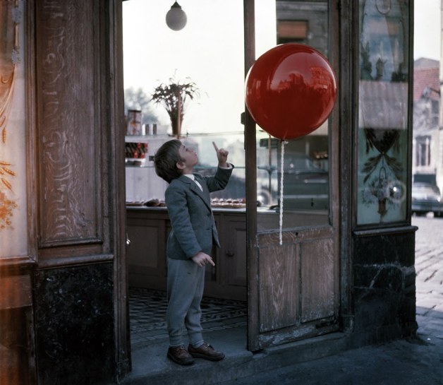
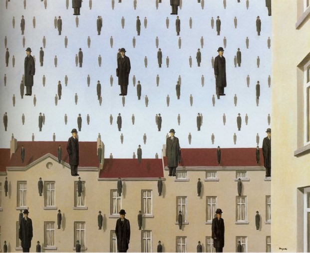
It seems Wiseman drew inspiration from Le Ballon Rouge (The Red Balloon), a 1956 fantasy featurette directed by French filmmaker Albert Lamorisse and René Magritte‘s Golconda.

Movie still from Le Ballon Rouge.
It won numerous awards, including an Oscar for Lamorisse for writing the best original screenplay in 1956 and the Palme d’Or for short films at the 1956 Cannes Film Festival. The film also became popular with children and educators. This is the only short film to win the Academy Award for Best Writing (Original Screenplay) and to receive a nomination for anything besides Best Live Action Short Film. Lamorisse used his children as actors in the film. His son, Pascal Lamorisse, plays Pascal in the main role, and his daughter Sabine portrays a little girl.

Golconde, René Magritte, 1953

As was often the case with Magritte’s works, the title Golconda was found by his poet friend Louis Scutenaire. Golkonda is a ruined city in the state of Telangana, India, near Hyderabad, which from the mid-14th century until the end of the 17th was the capital of two successive kingdoms; the fame it acquired through being the center of the region’s legendary diamond industry was such that its name remains, according to the Oxford English Dictionary, “a synonym for ‘mine of wealth’.”
Magritte included a likeness of Scutenaire in the painting – his face is used for the large man by the chimney of the house on the right of the picture.

To watch the music video, please take a gander at The Genealogy of Style‘s Facebook Page:https://www.facebook.com/pages/The-Genealogy-of-Style/597542157001228?ref=hl

The Son of Man in Popular Culture

genealogy of style
https://thegenealogyofstyle.wordpress.com/2015/04/23/the-son-of-man-in-popular-culture/


The Son of Man in Popular Culture


Rate This

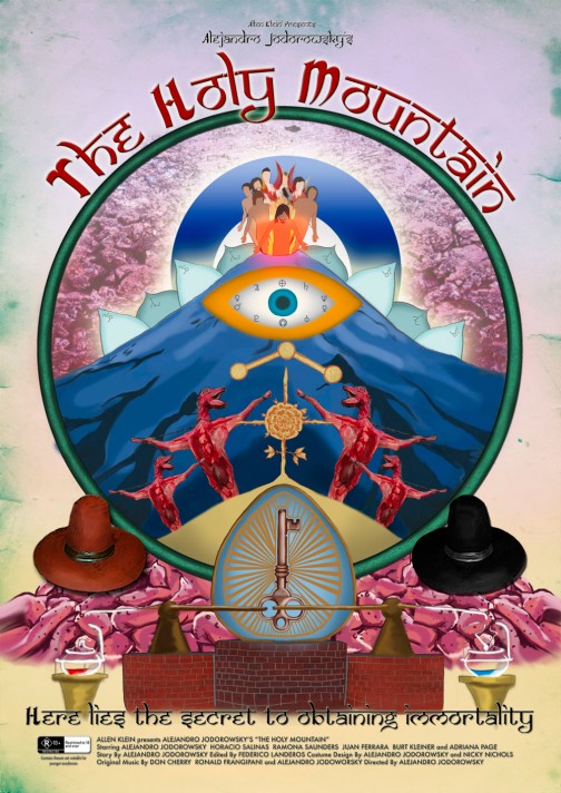
The Holy Mountain (Alejandro Jodorowsky, 1973) movie poster

 
René Magritte‘s The Son of Man appears in Alejandro Jodorowsky’s film The Holy Mountain, on a wall in the house of Jupiter. The film was produced by Beatles manager Allen Klein of ABKCO Music and Records, after Jodorowsky scored an underground phenomenon with El Topo (The Mole) and the acclaim of both John Lennon and George Harrison (Lennon and Yoko Ono put up production money).

 
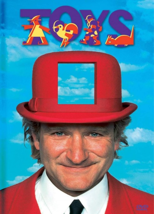
Robin Williams in Toys (Barry Levinson, 1992).
The set design, costumes, and promotional poster reflect the painting’s style.

 
A parody of the painting, with Bart behind the floating apple, can be seen briefly at the start of The Simpsons episode No. 86  Treehouse of Horror IV (1993)

 
The painting appears briefly on the video for Michael Jackson and Janet Jackson’s song Scream , on the “Gallery” section:

 
Still from Michael Jackson and Janet Jackson’s Scream music video (Mark Romanek, 1995)

 
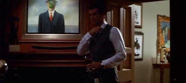
The Thomas Crown Affair (John McTiernan, 1999)

 
The Son of Man appears several times in the 1999 version of The Thomas Crown Affair, especially in the final robbery scenes when men wearing bowler hats and trench coats carry briefcases throughout the museum to cover Crown’s movements and confuse the security team.

 
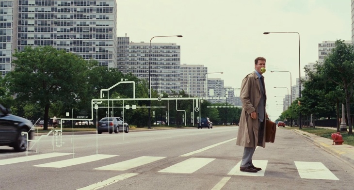
Stranger Than Fiction (Marc Forster, 2006)

 
This is not an Apple, illustration by John Cox, 2007

 
In the film Mr Magorium’s Wonder Emporium (Zach Helm, 2007), the painting is seen hanging on the wall half finished; at the end of the film Mr Magorium is seen to be painting the rest of it.

 
This painting also shows up at the end of the film Bronson (Nicolas Winding Refn, 2008). British prisoner Charlie Bronson takes a hostage and turns him into this particular portrait

 
 In the movie 500 Days of Summer (Marc Webb, 2009), the bowler hat and green apple can be seen in Summer’s apartment

 
The cover of the book Rubies in the Orchard: How to Uncover the Hidden Gems in Your Business (2009) has a version of the painting, with a pomegranate

 
In Jimmy Liao’s illustrated book Starry Starry Night (2011), the protagonist girl, with the painting illustrated behind her, imitates the painting to express her protest against her parents’ long term fighting.

 
In Gary Braunbeck’s novel Keepers (2005), the antagonist figures (the “Keepers” of the title) resemble the nattily-dressed, bowler-hatted figures of Magritte’s painting. Also, in the opening scene of the book, the reference is directly made and explained to this resemblance because of an apple-scented car air freshener printed with the image of the painting hanging in the protagonist’s car.
In Lev Grossman’s 2009 novel The Magicians the antagonist is a man wearing a suit, with his face obscured by a leafed branch suspended in midair.

Saturday, 4 April 2015

Carl Warner’s Whimsical Food Landscapes

brain
http://www.brainpickings.org/2011/11/09/carl-warner-food-landscapes/

Carl Warner’s Whimsical Food Landscapes

by 
What the London skyline has to do with asparagus, rhubarb, and Pink Floyd.
British photographic artist Carl Warner, whom you might recall as one of our favorite architects of edible landscapes, is a master of food and form, crafting astounding fantasy food landscapes that are part Ansel Adams, part Anthony Bourdaine, part your childhood daydreams dreamt from the counter of your grandmother’s kitchen. These miniature vignettes are painstakingly hand-crafted with only minimal Photoshop involvement and exude a kind of vibrant whimsy that stands in stark contrast with the mundane, dully ordinary ingredients Warner uses. Food Landscapes collects Warner’s most magnificent work, alongside detailed production notes and ingredient lists for each scene.
Making landscapes out of food seems like a rather unusual thing to do for a living, and people often ask, ‘What made you start doing this?’ It seems that the burning heart of this question is really the curiosity about what it is that motivates any human being to do something out of the ordinary, and my short answer to this is usually a simple, because I had the idea and I chose to do something about it.” ~ Carl Warner
Salmon Sea
Smoked salmon sea, dark soda bread rocks, sugar and pinto beans sand and pebbles, foreground rocks from new potatoes and parsley; pea pod and bean sprout boat, side of salmon sky
Coconut Haystacks
Parsley trees with horseradish trunks, red cabbage sky, toasted almonds as distant haystacks, and loaves of bread for hills
Chinese Junk
The roster of ingredients includes dried lotus leaves for snails, noodles for the wood floor, physalis lanterns, and the obscure wild green yamakurage for the rope.
And since we’re on the subject of influences today, Warner traces the kernel of his inspiration to the work of Tessa Traeger, a food photographer who in the early 1990s published A Visual Feast, a collection of painterly, two-dimensional pictures composed using food. Warner wondered whether he could take this a step further and create three-dimensional vignettes with food. Then, one day, as he was strolling through the fruit and vegetable market, he noticed the curving trunks and parasol canopies of portobello mushrooms were reminiscent of trees in the African savannah. He quickly grabbed the mushrooms and some grains, and headed back to his studio to create a tabletop scene that would photograph like a larger landscape. The rest was creative history.
Of his start with photography, Warner recounts:
For me, drawing and music were a means of escape into other worlds and alternate realities, and this provided the means to stimulate and exercise the muscles of my imagination. This went on for years, until I discovered photography. I found that I could photograph the real world but make it surreal by the techniques and the processes I was able to use in the camera and in the darkroom. I soon realized that this was a lot quicker than drawing, and I was able to develop ideas and concepts with more ease… At the same time, album cover art was in its heyday, and graphic designers such as Storm Thorgerson of Hipgnosis were creating amazing surreal images for bands like Pink Floyd. I knew that this was what I wanted to do with my life.”
Celery Rain Forest
Canope made of okra with dried chili oarsman, tiny mushroom hat and a cardamom pod; path: pumpkin seeds, sunflower seeds and lentils
Cart & Balloons
Balloons made of red onion, apple, garlic bulb and other fruits; balloon baskets: nuts; hills and fields: bread, cucumber, string beans, green beans, corn, asparagus
Broccoli Forest
Broccoli trees, chopped parsley ground, fresh herb plants, small foreground rocks from Jerusalem artichokes and potatoes, cumin, turmeric and fennel seed pathway, crusty bread rocks, sugar waterfall, cauliflower clouds
London Skyline
Riverbank walls: panini; lamppost: mackerel, asparagus, onion, vanilla pods; London Eye: green beans; courgette, leek, lemon, rhubarb supports; The Dome: green melon.
A pinnacle of finding magic in the mundane, Food Landscapes is an absolute treat and a living manifesto for the power of truly running with the seemingly crazy creative ideas that take hold of your imagination.
Images courtesy of Carl Warner / Abrams Books

‘Yearning for a more beautiful world’: Pre-Raphaelite and Symbolist works from the collection of Isabel Goldsmith

https://www.christies.com/features/pre-raphaelite-works-owned-by-isabel-goldsmith-12365-3.aspx?sc_lang=en&cid=EM_EMLcontent04144C16Secti...